
I have to make a powerpoint presentation on topic 'Constuctions'. Please give me some tips and tricks so that i can make it look more interesting and informative.

Brijendra Pal answered this
I would like to suggest you that go through the study material and collect important topics from the given chapter and then use those points in your slide so that all the points will be covered.
Regards
- 0
Nikhil Rana answered this
- -1
Priyanka Saravanakumar answered this
HERE ARE FEW TIPS,
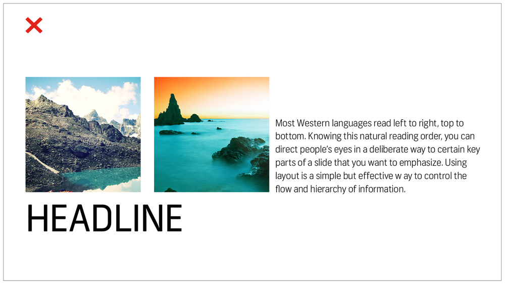
1. Use layout to your advantage.
Most Western languages read left to right, top to bottom. Knowing this natural reading order, you can direct people’s eyes in a deliberate way to certain key parts of a slide that you want to emphasize. Using layout is a simple but effective way to control the flow and hierarchy of information.
Try to structure your slides more like this:

And not like this:
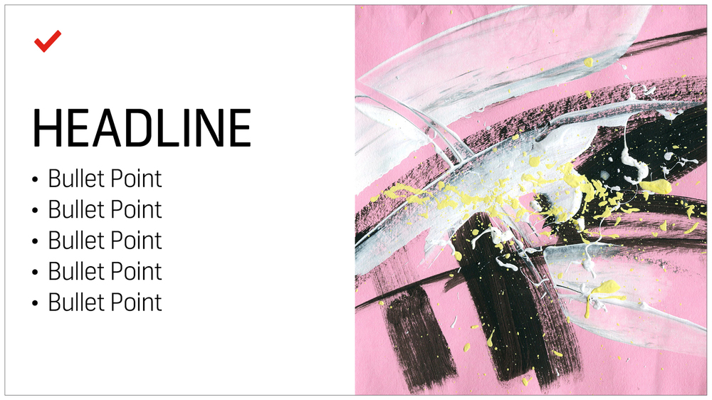
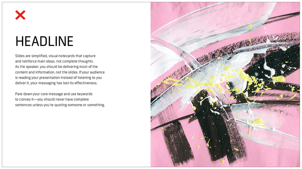
2. No sentences.
Slides are simplified, visual notecards that capture and reinforce main ideas, not complete thoughts. As the speaker, you should be delivering most of the content and information, not putting it all on the slides. If your audience is reading your presentation instead of listening to you deliver it, your messaging has lost its effectiveness.
Pare down your core message and use keywords to convey it — you should never have complete sentences unless you’re quoting someone or something.
Stick with this:
And avoid this:
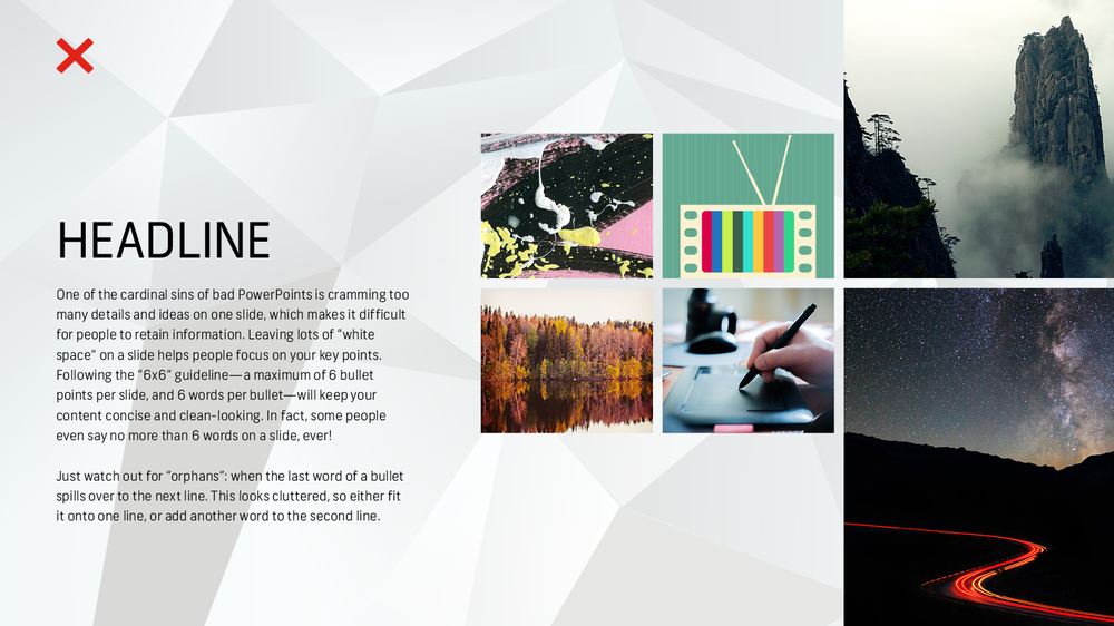
3. Less is more.
One of the cardinal sins of bad PowerPoints is cramming too many details and ideas on one slide, which makes it difficult for people to retain information. Leaving lots of “white space” on a slide helps people focus on your key points.
Following the 6×6 guideline — a maximum of 6 bullet points per slide, and 6 words per bullet — will keep your content concise and clean-looking. In fact, some people even say you should never have more than 6 words per slide! Just watch out for “orphans” (when the last word of a bullet spills over to the next line). This looks cluttered, so either fit it onto one line, or add another word to the second line.

Slides should never have this much information:
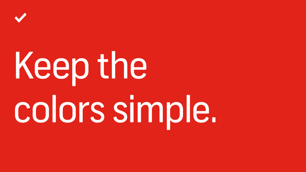
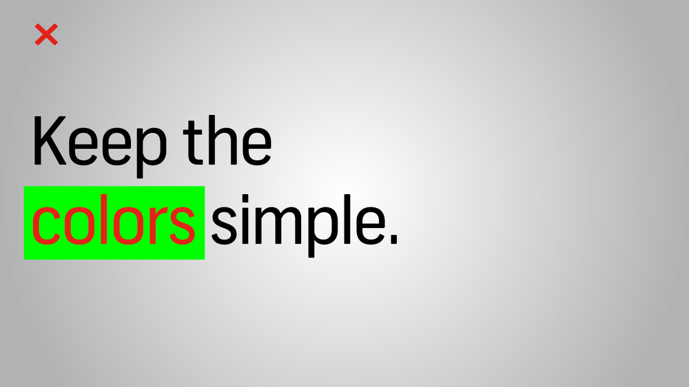
4. Keep the colors simple.
Stick to simple light and dark colors. Exceptionally bright text can cause eye fatigue, so use those colors sparingly. Dark text on a light background or light text on a dark background will work well. Also avoid intense gradients, which can make text hard to read.
If you are presenting on behalf of your brand, check what your company’s brand guidelines are. Companies often have a primary brand color and a secondary brand color, and it’s a good idea to use them in your presentation to align with your company’s brand identity and style.
If you’re looking for color inspiration on your next presentation, you might want to check out our Palette tool, where you can browse images by color palette.
Stay away from color combinations like this:
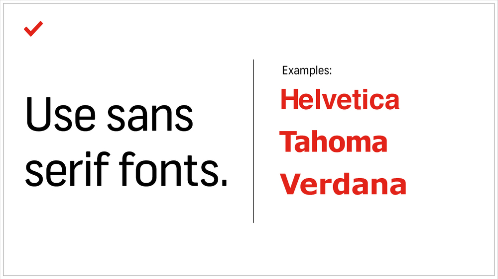
5. Use sans serif fonts.
Traditionally, serif fonts (Times New Roman, Garamond, Bookman) are best for printed pages, and sans serif fonts (Helvetica, Tahoma, Verdana) are easier to read on screens. These are always safe choices, but if you’d like to add some more typographic personality, try exploring Google Fonts. The open-source collection is free and you can download from more than 600 font families. Try to stick with one font, or choose two at the most. Fonts have very different personalities and emotional impacts, so make sure your font matches the tone, purpose, and content of your presentation.
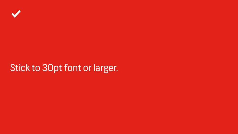
6. Stick to 30pt font or larger.
Many experts agree that your font size should be at least 30pt. Not only does it ensure that your text is readable, but it also forces you to include only the most important points of your message and explain it efficiently, since space is limited.
7. Avoid overstyling.
Three of the easiest and most effective ways to draw attention to text are: bold, italics, or a change in color. Our eyes are naturally drawn to things that stand out, but use it sparingly. Overstyling can make the slide look busy and distracting.

As you design a Power Point presentation, remember that simplicity is key and less is more. By adopting these simple design tips, you’ll deliver a clear, powerful visual message to your audience.
Try to make it a point to organise your information that you have gathered in an effective way.
HOPE IT HELPS..:)
- 2